I’ve been out of town at a conference for the past few days, and haven’t had much of a chance to post items on the site. I’m back, however, and you can expect the flow of wisdom to become a ferocius torrent.
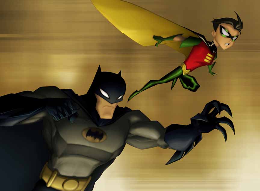
One thing that struck me recently was upon viewing an episode of the current Warner Bros. cartoon series The Batman, which runs on KidsWB, a Saturday morning block of cartoons. The program premiered in 2004 and is in its fourth season, somehow.

What is not particularly interesting is the narrative I saw, from one of the first-season episodes. The series, from what I saw and have been able to glean from various sources, deals with Bruce Wayne’s early years as the Batman, in which he establishes what the character will be like in his prime, as depicted of course in numerous other media products over the past three quarters of a century. In sum, the show covers Bruce’s early years as the Batman.
Not surprisingly, the story I saw involved several fanciful villains led by a particularly ambitious and egotistical one, in this case the Penguin, whom the Batman must subdue lest all sorts of badness rain down on the blithely sheeplike people of Gotham.
An interesting observation is that we don’t see any of those innocent bystanders in the episode I saw. They are more of a concept than a reality. This seems to fit well with a sense a good proportion of Batman fans have conveyed, that the series is not as "gritty" as Warner’s previous Batman cartoon series (which was a superb example of this kind of series). Not showing the bystanders would seem to take away some of the sense of danger that would otherwise be experienced by younger children who could more easily thereby see themselves as threatened by the villains and narrative events. Batman fans seem in general to judge that the characterizations and story lines of The Batman are not as rich as in Batman: The Animated Series, especially through most of season one, although they do also seem to agree that the show becomes quite interesting thereafter.
 From my viewing of a first season episode, this seems a fairly accurate assessment though by no means a dispositive condemnation even of the first season: the program seems to be geared toward a younger audience, and there’s certainly nothing wrong with that. If the WB wants to create a laudable hero for younger wee ones, I’m definitely not going to complain.
But what I found most striking and rather appealing about The Batman was the visual style. The characters are obviously strongly influenced by Japanese manga comics and anime. They have that odd combination of sweeping, angular, but rounded features and body shapes that is common to those Japanese forms of drawing. And it is very interesting to see that style applied to the familiar Batman characters, as it brings them some new life.
This Eastern style of character drawing, however, is joined to a thoroughly classical use of perspective in the visual settings—the background locations, the environment in which the characters operate. Here, the buildings, streets, rooms, and other locales are presented through a vivid use of classical perspective with a single focus point that is usually in the horizontal center of the screen. The sense of perspective is very strong in the episode I saw, and creates a sense of a highly logical world in which the wicked behavior of the villains is a disturbance, not an inevitable outcome of the circumstances surrounding them. Even when odd angles are used, the perspective is not distorted.

Unlike films noir and most modern action films, with their frequent use of deliberately distorted visual perspectives, and unlike Batman: The Animated Series, the visual style of The Batman openly suggests that good and evil are human choices, not just phenomena flowing inexorably from environmental (and genetic) circumstances.
In this way, the program seems to send a very salutary message to young people: the choice is yours.
Is this a stretch, a matter of seeing too much significance in something trivial? (Translated: Is Karnick seeing too much in this?) I don’t think so at all. This visual style is definitely present in the program, and the contrast between the visual presentation of the characters and their surroundings, whether consciously chosen or not, is real. And its meaning seems to me evident, strong, and significant. Those of us who believe in free will should find this visual presentation an interesting and happy thing.

what was the name of the baker in batman?
I cannot imagine a more heartening compliment, Hunter. Thanks.
Your analysis of artistic elements reminds me quite a bit of Francis Schaeffer. Good stuff.